UX Design & Research
—
2022
Easily revisit important notes
Team
Sole Designer
STATUS
Personal Project

Understanding & solving unique challenges with revisiting important notes
Context
People make highlights from readings for various reasons, such as to retain important information, to revisit key points later, or to share insights with others.

Problem
Readers use highlighting to draw attention to important information in a text to refer later. However, with multiple platforms used for reading, these highlights often get lost.

but, why should we revisit highlights in the first place?

Qualitative Research
I wanted to understand how avid readers manage and revisit important parts of what they read, and the challenges they face while doing so I conducted interviews with six individuals who read at least one book or article per month.

Through these conversations I synthesized the following user paint points

and the key takeaways from understanding the market were

View Detailed Market Research
Target audience


So, let's help readers like Lisa!

Prioritizing features based on their impact on user satisfaction and delight
The UX of Emphasis is based on the Kano model, categorizing user preferences into five categories: basic, performance, excitement, indifferent, and reverse. The high level characterization for Emphasis is based on user expectations and how to exceed them:

Expected features

Features for delight

Early explorations
To ensure a readable and usable experience, I first sketched out the essential screens that users would need to access their highlights. Following that, I proceeded with creating wireframes for early testing.

Iterations based on user testing
Based on early user testing, one of the main insights was the importance of being able to filter highlights according to customized topics or moods.
Interaction Design Principles

Prototypes
Onboarding
I aimed to create a fast, effortless, and enjoyable onboarding process. The wording used is meant to enhance predictability. If given more time, I would investigate simpler methods for logging in and linking reading accounts.
Filter by mood/custom tag
Users have the ability to sort their highlights using custom tags or default tags that they assign. To improve accessibility, with more time, I would investigate an option to scroll through different tags at the bottom of the screen.
View context of each highlight
To view the context of a highlight in the book, the user can simply perform a long press on it. My research had shown that readers often need to see the context to fully understand the highlight.
Monetization model
Initially, the plan is to monetize through a subscription model. However, I will further explore other options to reward and monetize as time goes on.
Establishing the brand identity for Emphasis
Building a recognizable & memorable logo

Choosing typography for readability and clarity

Testing the scalability of Emphasis brand identity


Learnings & Reflections

and now..


Young voices, big impact
Our target audience was a diverse group of curious young learners from around the globe. We co-created the experience with 11 children—boys and girls from six different countries—through conversations in five languages. This ensured our design was both inclusive and resonant.
The world through their eyes
We used storyboarding and card sorting activities to step into the children’s world, exploring how they learn and what they care about. These exercises revealed their unique perspectives and helped us design experiences that truly resonate with them.
With their point of view in mind, we honed in on five pivotal areas to focus on in our design solutions

Through quick testing of our initial ideas, we landed on two concepts that could simplify complex ideas through play, while also appealing to a wide range of audiences.
Concept 1: Using AR
Phase 1 features a physical card game, providing a tactile, peer-based way for children to learn without needing internet or smartphones.
Phase 2 takes learning further with a mobile app that uses AR to deliver immersive micro-learning experiences. This phase helps children engage with complex concepts in a way that’s both interactive and relevant to their own context.
Concept 2: Learn through play

Phase 1 introduces a card game that builds awareness and kickstarts the learning process in a fun, approachable way.
Phase 2—a web app that extends learning with adjustable difficulty levels—the card game stands alone as a valuable resource, offering an engaging, self-contained learning experience.

CARD GAME


From paper sketches to digital prototypes: a journey shaped by iterative user testing.
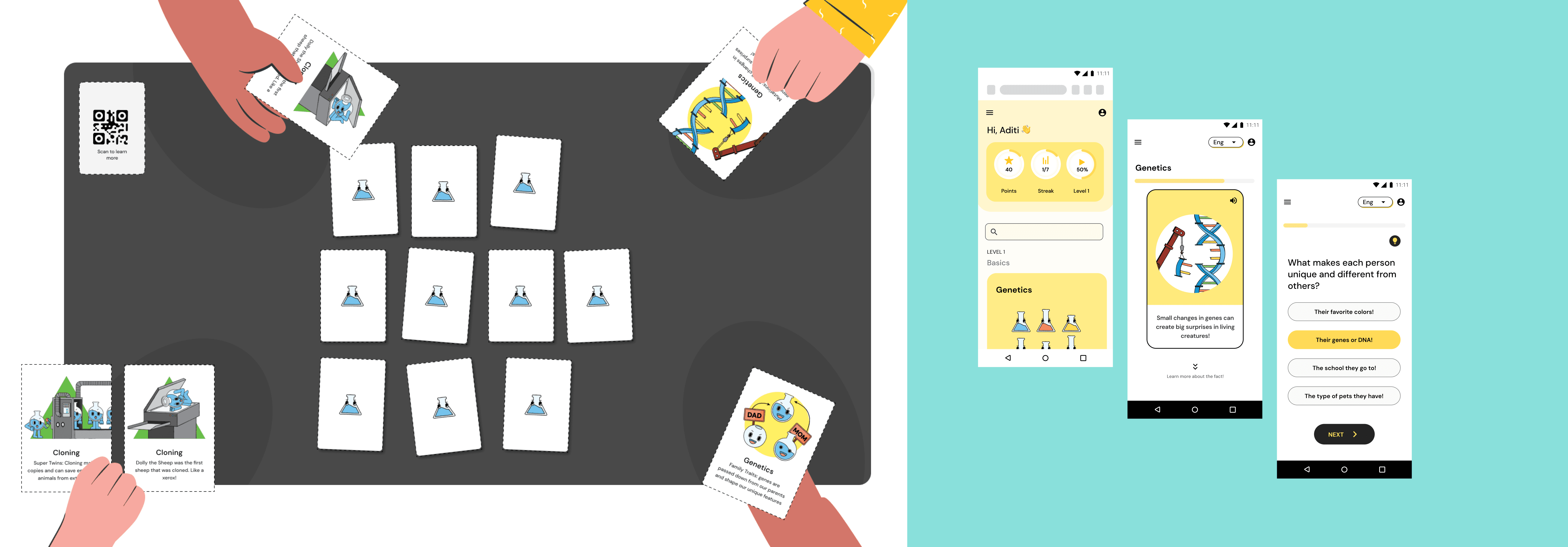
Card game + Web Application prototypes

Our research with children revealed that illustrations significantly enhance comprehension, enabling them to grasp complex concepts more effectively through visual analogies.
MOBILE APPLICATION

Images: AR game concept based on child’s quote “Vaccination is like boxers fighting the bad things in your body”
The story of Dalisay
Execution & Reach
Project Play is a UNICEF initiative that makes pre-printed and pre-cut toys onto RUTF cardboard packaging. This is where our execution strategy stemmed from. We designed our entire game experience to be a part of these boxes and enable biotechnology to touch the lives of millions of children.

Play is critical for healthy childhood development, helping to build cognitive, social and physical skills. Designed to be inclusive, designed with contrast colours, tactile features, easy grip, ensuring all children with and without disabilities can play with them.
UNICEF could reach an estimated 7.3 million children by repurposing RUTF cardboard boxes into toys.
The team
